Tuesday, 16 October 2012

Digipak Research: Font Ideas

1950's Style Font Ideas

Here are some of my font ideas for the title of the album, 'Ghosts'. These fonts could also be used for the logo design for 'Lexi and the Spectrum' and within the advertisement. These fonts have been taken from www.tackorama.net/Fonts.

'Channel' - I really like this font, i think the swirly appearance would work really well as it has a vintage feel but also works really well in bright, pop, vibrant colours that match the kind of look I want my album cover and digipak to have. It also goes well with the 1950's diner feel.

'Cinerama' - I really like the unique look of this font, however I don't think it's quite right for the look I want to achieve, though it does have a really good 1950's vibe.
'Classic Car' - I really like this text as I think it's one of the best at reflecting the 1950's retro american diner feel, however I feel it is a little to strong or harsh as a text, I would prefer a more curvy and fun font.
'Scarlet Ribbons' - I think this is my favourite font as it captures all the element of my artist; the 1950's vintage feel, the fun american diner look of the video and album and the modern artist's music. I feel it has a more modern day feel whilst also feeling very 1950's inspired.


'Air Conditioner' - I like this font as I think it best shows the american diner idea, it's also very 1950's and fun.


'Swizzle Sticks' -  I really like the fun, retro appearance of this font, it really helps to emphasise the links with the 1950's and american diners. I think this could work really well as the font used for the album title.


Monday, 15 October 2012

Digipak Research: 1950's Influences


1950's Adverts

This is an advertisement for hair rollers from the 1950's. I really like the colour scheme used within the advert as it has a very vintage and retro look which matches that of our artist and music video. The use of just the pale pink as the main colour works really well as it has a subtle appearance. The black and white photos also contrast really well with the sepia background and pale pink. I think I will try to incorporate this basic but vintage colour scheme into my digipak and advert. However, I would chose to use much more interesting font as I think the font here doesn't fit very well with the overall advert.
I really like the retro look within this 1950's Coco-Cola Overseas advert, I think the colour scheme works really well as it captures the era and has a very vintage feel, however I plan to use a much simpler colour pallet containing a few distinct colours, such as the 3-colour pallet within the hair rollers advert above. I do however, much prefer the text used within this advert for 'overseas', as I think it also really captures the era and has a distinctive appearance. I would like to use text similar to this within my digipak and poster advertisement, perhaps within a logo for my artist. 
1950's Music Album Cover
I really like the retro and vintage look of this album cover, and the idea of using a 1950's american diner as this fits well with the ideas in the video and our artist. 


Monday, 8 October 2012

Digipak Reaseach: Cover Ideas

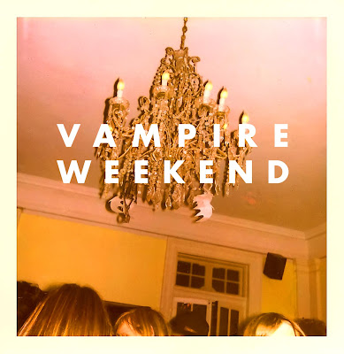
Vampire Weekend - Vampire Weekend

This is the album cover of Vampire Weekend's self named album. I like the simplicity of this cover and the basic sepia colour scheme; these factors give the album a statement cover with a unique and retro/vintage feel. I think this style, and simple layout would work well with the artists style and album theme.
The colour scheme and vintage feel would also match the retro/vintage 1950's style of the video and artist within the video, therefore clearly showing the style of the artist and music.Here I have created a mock up of a cover idea, copying the Vampire Weekend album for our my artist 'Lexi and the Spectrum'. I have used the same colour scheme and basic layout with the artist name and album name in block capitals and the centre of the cover. The image I have used for this mock-up was one I found on the internet. 
I have also created my own version which takes the idea of a photo of a basic object; in this case a 1950's phone, which relates to a prop used within our music video as well as the era we have based our video on and the era from which the artist is inspired. The picture used for this was also one I found on the internet, but also one that could be easily re-created. I like the brighter appearance of this cover idea and the fact there is more relevance to the object.


-------------------------------------------------------------------------------------------


Pink Floyd - Dark Side of The Moon

I also like the simplicity of this album cover for Pink Floyd's 'Dark Side of the Moon'. This album was one of the influences of our artist from the 1950's. I therefore think a reference to this album/artist would be relevant and representational of the artist influences . I also like the idea of the 'spectrum' as this ties in with the name of my artist; therefore I could take this element and incorporate it into my cover and digipak designs.


--------------------------------------------------------------------------------------------

Arcade Fire - The Suburbs

I really like the ideas used within all eight of the varied Arcade Fire cover artwork for 'The Suburbs' album. The theme of vintage effect, film photographs with a gain effect works really well and gives the album a unique look that reflects the music of the artist. This also matches the vintage feel within out music video and would therefore work for my artist 'Lexi and the Spectrum'.
I have created a mock-up cover taking inspiration from both of these Arcade Fire covers. I took the idea of a car and found an image on the internet of a 1950's mercedes benz. As I really like the simplicity of the black and white 'The Suburbs' album cover, I used a black and white image of the car. I also used the idea of plain white text over the top of the image from the second Arcade Fire cover, however I added in shadowing on the text to reflect the album title 'Ghosts'. 
----------------------------------------------------------------------------------------
Katy Perry - Teenage Dream and One of the Boys


I really like the style of Katy Perry's album covers, I think they have a really fun and pop feel that reflect both the music and the artist herself. This is the kind of feel I want my digipak and advert to have. I want to achieve this by combining the bright colours and fun feel with retro and vintage elements, such as props, costume or colours. I intend to use the idea of a 'logo' for the artist's name. Here, I have created a basic mock-up of the kind of logo I intend to make for my artist, this one was created using a font I found that is very similar to the one used here in Katy Perry's logo. I like the colourful and fun appearance that this logo has, however I think it could better fit the 1950's retro and vintage theme with some alterations.
------------------------------------------------------------------------------------------------------------
Marina and the Diamonds - Electra Heart, The Family Jewels and Singles

Marina and the Diamonds' albums all have a really unique look. They have a theme of using one main image of the artist herself and an interesting and unique text. 


Monday, 1 October 2012

Risk Assessment for Production


RISK ASSESSMENT

LIGHTING AND ELECTRONICS
  1. When using lighting ensure all plugs are inserted correctly and are not loosely fitted
  2. Check bulbs work before inserting them into a live stand.
  3. Ensure all wires are not tangled and to the side of any walkways - make all personnel aware  of wires and their location before filming.
  4. Do not keep lighting and bulbs on without supervision or they could overheat and set a light.
  5. Make sure all stands are turned and stable as they could fall over.
  6. If using lighting outside with an extension lead ensure that area is dry or covered to avoid damaging the cables and/or causing a fuse.
  7. Do not cover with any textiles or open raw materials.
  8. Ensure stands are fully attached and twisted to the furthest possible point to make sure they remain stable throughout filming.
VIDEO CAMERA & CAMERA
  1. Make sure video camera is fully attached to the tripod before filming.
  2. Safely pack away and check video camera is fully functional before and after filming.
  3. Keep fingers clear of closing tripod - close the tripod slowly to avoid injury.
LOCATION: THE MAIN BEDROOM
  1. Ensure all occupants, directors and actors are aware of all fire exits and call points before filming.
  2. Do not run on set as this could result in a fall and injury.
  3. Do not cover electronics with any textiles furnishings.
  4. Ensure when using make-up equipment electronics such as hair straighteners and curlers that they are kept on a solid flat surface and under supervision whilst turned on and plugged in. Make sure they are turned off and moved aside to cool down after use.
  5. Do not block fire exits with props or equipment such as suitcases or unused lighting equipment
  6. Refer back to all relevant LIGHTING AND ELECTRONICS risk assessment also when using these.
  7. Do not leave any props or equipment on the floor as this could is extremely accident-prone if stepped on
  8. Do not leave any sharp items such as knifes, scissors or equipment open and ensure they are put away efficiently and safely.
LOCATION: GARDENS
  1. Make sure all lighting cables are suitable for outdoor use, if weather is wet ensure cables and plugs are covered safely with a water-proof cover
  2. Make sure areas for smoking are safely with no open flammable materials that could set alight if in contact with loose ash e.g. wood or bark
  3. Make sure cigarette lighter is safely put away and closed after use and not left on the floor which could be stepped on and broken
  4. Ensure cigarette is firmly in the cigarette holder when using the prop
LOCATION: THE DINER
  1. Ensure all spills are mopped up immediately.
  2. Do not run - especially as tiles could be slipped on, ensure floor is not wet.
  3. Refer back to all relevant VIDEO CAMERA & CAMERA risk assessment also when in this location.
  4. Make sure filming equipment etc creates no threats or hazards to other people on location as this is an area open to the public.

Examples of Pop Genre Conventions

Here is an example I have found of media products from the pop genre that both conform and challenge the conventions I found within the pop genre:

Album Artwork
Poster Advertisement
Colour Pallet
Katy Perry's album art work, used throughout her campaign, is all very united and has a clear and recognisable appearance, conforming to the pop genre conventional use of a strong theme. The theme and individual products themselves also all conform to the idea of bright colours and a fun appearance, with the main colour pallet containing bright blues, pinks, reds and white. The whole campaign also has a heavy emphasis on it's sweet/candy based theme, conforming to the pop genre convention of a fun appearance. Katy Perry's album theme is also reflected within her costume as she wears bright colours within her music video, however the costumes themselves do not conform to the conventional idea of the artist wearing mainstream clothing as Katy Perry wears candy-related outfits within her video, this does however match the theme and therefore develops the convention to create a unique appearance for the artist.

The video itself has a very fun and exciting overall look as it carries on with the bright colours and candy theme, it also has a really lighthearted and upbeat appearance that matches that of the upbeat song and lyrics within it. This conforms to ideas that pop genre songs are often fun and upbeat as this is something that appeals to a younger audience. The video also conforms to the idea of having a heavily performance based pop genre video as the artist is featured throughout the video and sings/lip syncs for the majority of the song. However, there are elements of the video that challenge or develop conventions more than they conform to them, for example, the video does not contain a 'performance' in which the artist has performs a choreographed dance, nor is there a strong narrative theme formed by the meaning behind the lyrics. Instead interest is created within the video in a more creative and unique way, challenging the conventional 'performance' pop genre video base and focusing more on the theme.

Music Video (California Gurls, Album Single):