Showing posts with label Digipak. Show all posts

Thursday, 8 November 2012

Digipak and Advertisement Fonts

On both my digipak and advertisement I have made alterations to the text post-feedback. I have not changed the font used as I think the current font 'Channel' works really well. Instead I have edited the text in order to help it stand out better, especially against my drawings which will be predominantly in the same colour. The images below show the editing I have done; the first image shows the text from my first draft digipak and advertisement and the second shows the changes I have made for my final products.

In this first version from my draft I have used no editing on the text and left it to stand alone, although I think this works well with my basic and simplistic appearance I felt it was a little lost on both the advertisement and digipak. Therefore, for my final media products I wanted the album name and artist's name to have a much more dynamic and powerful appearance. For this reason, I added in various editing styles to the font, such as outer glow which I feel works really well as it helps to make the text stand out from both the background and the main images. I have also used drop shadow to add some depth to the text, I feel this fits really well with the album name 'Ghosts' as it creates a shadowy ghost-like effect to the font.

Digipak and Advertisement Post-Feedback Changes

After recieving the feedback for my first draft digipak and advertisement I have decided to make many changes in addition to my main decision to use drawn images rather than photographs. These are some of the changes I plan to make:

Digipak:

Within my digipak I am going to change/remove several element. The first change i'm going to make is to remove the lyrics. I want to do this because I think the lyrics make my digipak appear far too cluttered and ruin the simplicity of the basic appearance I want the album to have. However, I still intend to use some text within the digipak and I am therefore going to include credits, disclaimers and further copyright information that I had not previously included in my first draft. The image on the right shows a mock-up version of my 'credit insert' for my digipak. I intend to use a very faint version of the main artist image from the cover within the background of this insert as shown here in the mock-up.
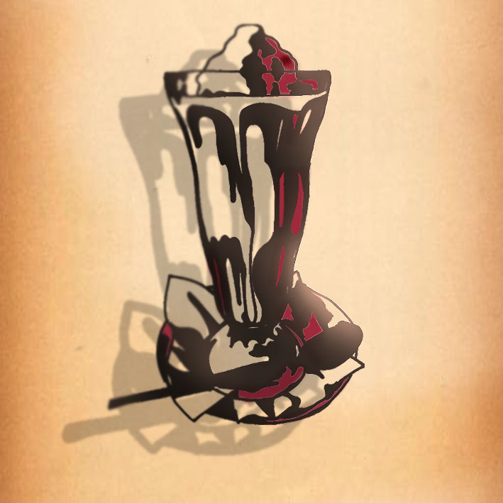
As I am no longer using photographs this also leaves my with 3 pannels of my digipak to be filled. To fill these spaces I am going to use my drawings of 1950's and album related objects to have a simplistic but statement appearance. The image on the right shows one of my new panels. I think these basic outline drawings will work really well when the digipak is put all together.


Advertisement:

As well as changing the photographs to drawings on my advert, as I have within my digipak, there are again other changes I intend to make. These changes are mainly to do with the text. Within my feedback I was told the font was too large so I have reduced this down considerably, I also felt that as it took up too much room, it ruined the simplistic look I want my poster to have. I have added some effects to the text down the right hand side of my poster to make certain words/phrases/information stand out without increasing it's size. These effects includes outer glows, drop shadows and bevel. I have also made the web address at the bottom of the poster larger and added in the websites logo to help draw attention to it without making it too large the image above shows this change. In addition to this I will include a Facebook address and possibly also the artists website address on my final advert. The picture below, on the left, shows the main text with its alterations, this is not to scale, but shows the variations in font and editing. I have also however, considered using the same font for all of the text and use the same editing through out the text. If I do this I would use the 'Channel' font as this matches the title and artist's name on the advert, I also feel this will help the text stand out as a whole. The picture below on the right shows this.


On my first draft advertisement the main image used was one from the digipak but not the cover image, however I used a small image of the album within the advert. For my final advertisement I intend to remove the smaller image, as I felt this didn't fit in with the rest of the adverts overall appearance. I also intend to change the main image to the same image that is used on the cover of my digipak as I feel this will make my products work better together with more continuity between them.

Digipak and Advertisement Images

These are my original drawings that I will use in my digipak and advertisement. To do these I scanned my own drawings into photoshop and edited them to put into my final products. The pictures below are post-editing, however I may make more changes once they are placed into my digipak and advert.


Digipak: Credits and Copyright

For my first draft digipak I only included a small amount of copyright information. In my final digipak I intend to include the full copyright information and credits. Below is the back cover from Marina and the Diamonds album 'Electra Heart', I will use the credits and copyright from this album as a template for my own album.


Credits:


Tracks 1 / 4 Produced by Rick Nowels. Mixed by Mark 'Spike' Stent. Track 2 Produced by Dr. Luke and Cirkut for Prescription Songs. Mixed by Serban Ghenea / Track 3 Produced by Dr. Luke and Cirkut for Prescription Songs and Co-Produced by Diplo for Mad Decent. Mixed by Serban Ghenea Track 5 / 7 / 8 Produced by Greg Kurstin. Mixed by Serban Ghenea. Tracks 6 / 10 / 11 Produced by Rick Nowels and Devrim Karaoglu. Mixed by Mark 'Spike' Stent. Tracks 9 / 12 Produced and Mixed by Liam Howe. ℗ 2012 679 Recordings Ltd. © 2012 679 Recordings Ltd. The copyright in this product including without limitation all text, sound recordings, audio visual recordings, artwork (whether in part or whole) contained in this product, is owned by 679 Recordings Ltd. Unauthorised copying, hiring, lending, public performance, transmission and broadcasting of this product including the text, sound recording, audio visual recordings and artwork (whether in part or whole) is prohibited. All rights reserved. This enhanced CD should automatically launch under Windows 95/98/NT/2000/XP/Vista/7 and on a Mac. Disclaimer: This multimedia program is provided to the user without warranties, express or implied of any kind. 679 Recordings Ltd shall not be liable for any actual or consequential damages arising from the use of, or the inability to use, the program. You expressly acknowledge and agree that the use of this software is at your own risk. 
5053105215522 / LC14666 / Made In The EU. www.marinaandthediamonds.com

I will use these credits within my own digipak, making small alterations such as the website address.

Wednesday, 7 November 2012

Digipak and Advertisement Drawings

After getting my feedback I have decided to make several changes to my digipak and advertisement. I have now decided to use drawings instead of photographs as I think these will look better and more interesting. I will use a few drawings within my digipak, the first will be one of the artist, this will be the main image used in the album and also on the advertisement. The others are props and 1950's objects such as a milkshake and retro telephone. Below are the scans of my original drawings of our artist, Lexi and the Spectrum, and props, pre-editing:

Lexi and the Spectrum


Coco Channel Perfume


Milkshake


Mirror and Lipstick
Telephone


Tuesday, 6 November 2012

Hand Drawn Album Covers

After making the decision to use drawn images within my final digipak and advert, I have done some research into other album artwork that is hand draw. Hand drawn images is not something conventionally found within pop genre album campaigns, this is therefore challenging conventions, which I feel will help to give my campaign a more unique and distinctive look. As drawn images are more conventionally used with the indie music genre, I have done research into album artwork from both the indie and pop genres to give me some inspiration. 


The Foals - Antidotes
Mika - Life in Cartoon Motion
Kreayshawn - Somethin bout Kreay
 I really like this hand drawn album cover for the The Foals 'Antidotes' album, as I think the simplicity works really well, having small elements of colour helps to create added interest and gives the overall cover a really intriguing appearance. As this album is from the indie music genre, it conforms to more indie conventions than pop genre conventions. For example it has a very simplistic and individual appearance. The cover also has a casual feel due to the use of cream and black as the main colours for the majority of the image. To take an idea like this and use it within the pop genre would definitely challenge the pop genre conventions, for this reason I don't think it would work if i used a very indie inspired image for my drawings. However, I think that it could work really well if i developed this idea to create a drawn image, inspired by an indie cover, but adapted to conform to more of the pop genre conventions. For example, I think that a more cartoon like appearance would fit to more pop genre conventions as it would have a funner and more lighthearted appearance. A good example I have found is Mika's 'Life in Cartoon Motion' album cover, this is an example of a hand drawn album cover from the pop genre, although it challenges many pop conventions, I feel that it still has a really strong pop appearance due to the use of fun, cartoon style drawings and bright, vibrant colours. This also gives the album a conventional lighthearted look which appeals to the younger audience of the pop genre. Another album cover with a similar style to this is Kreayshawn's 'Somethin bout Kreay' album cover. Again, this album cover does not conform to many of the pop genre conventions, however, it does have a strong pop look about it due to the use of bright colours and a fun cartoon style. Both of these hand drawn pop genre album covers are great examples of how and indie style can be adapted for the pop genre. These also show that challenging conventions can work really well and still create a pop genre appearance. However, although attention is focused on the drawn elements in both cases, both of these two pop genre examples still feature images of the artist, something I plan to not do. This could make it harder to create a pop genre appearance for my digipak and advertisement as I have found that using an image of the artist is a very strong convention within pop genre campaigns. I will have to experiment with the overall look of my media products in order to create the right balance of bright colour and indie influences in order to create an effective pop genre appearance with a fun and lighthearted feel.

Monday, 5 November 2012

Draft Digipak and Advert Teacher Feedback

Digipak
  • Really promising, my digipak has a striking look which flows through into each of the panels. The images also look really good and the final digipak will have great images providing I can re-create these.
  • I should re-consider the placement, layout or amount of lyrics within the digipak as it's appearance is too cluttered.
  • I should re-consider the positioning of the telephone of the disc panel, as this image may look better in the centre.
High Level 3, 6/10

Advert
  • The image looks good but does appear too busy, although it ties in with the digipak.
  • More evidence of research for my advert is needed.
  • The left hand side needs improving as the font size is too large and the text overall doesn't fit well with the advert as a whole.
  • Consider star rating.
  • Record company logos and website text needs to be larger as it isn't clear enough.
Low Level 3, 6/10

Friday, 19 October 2012

Wednesday, 17 October 2012

Digipak Inside Panels

For the inside panels of my digipak I have decided on a few key elements I want to include in order to create the right appearance and theme, these are:

  • Photos of the artist, in black and white to create a vintage appearance
  • Song lyrics
  • Images of props to reflect the retro, 1950's theme 
  • Strong fonts, that also reflect the 1950's
I believe these 4 elements are really important for creating the inside panels for my digipak and in turn, achieving the right appearance for the whole album. I have made 3 inside panels for my first draft. All 3 of these panels include black and white photographs of the artist and the lyrics printed over the top in the font 'channel' which I also used on the front cover.

First Draft Inside Panels:


Here are two of my first draft digipak inserts and the two options for the third insert. For the first one I have used the 'Channel' font to put lyrics on my insert. I have placed the lyrics on the two sides of the insert to frame the photograph behind. This photograph is of Marina and the Diamonds, I got this photo off google and edited it in photoshop to create a more defined image in black and white. I really like the clarity and definition of the photograph here, it's really good quality and works really well in black and white. This is the sort of photograph I want to achieve myself if I use photographs in my final digipak.


In the second insert I have also used the same 'channel' font for lyrics. Again the lyrics frame the main image in the background. This is another photograph I have taken from google of Marina and the Diamonds. For this photograph, I also used photoshop to edit the photo and make it black and white. This photograph doesn't work as well as the previous image as the lighting is not good enough to work well in black and white and there wasn't enough contrast within the picture. This is something I will change with my own photographs as I want a more striking appearance within my photos.


For my third insert I have created two versions. For both, similarly to the previous two, i have added in lyrics and placed them so that they frame the image. However, i had a lot of lyrics to fit onto this insert and I feel it has become too cluttered. To try and resolve this i experimented with font. In the first version I used the same 'channel' font to tie in with the others however I felt this looked too busy and unreadable. For the second version I used the 'Scarlet Ribbons' font which left more space on the page and has a clearer appearance. However, I still feel this doesn't look quite right. 

Draft Digipak Cover Ideas

These are my first mock up ideas for my final cover idea, working through and making improvements I have created my final idea for my draft digipak. In the first mock-up I have used a 'stained paper' style background to give the cover a vintage feel. I have used the font 'Scarlet Ribbons' from my research for the artist's name, I have also added an outer glow to create a 'bubble' feel around the word, which adds a fun and pop element to the overall appearance of the cover. The main image used within the cover is a 'retro' style milkshake which ties in with my idea to incorporate the america diner style to reinforce the 1950's era of influence. I feel the prop itself and the high contrast and saturation used in editing makes it represent this idea well. The text used at the bottom for the album title 'Ghosts' is in the font 'Air Conditioner' which also works really well with the 1950's retro american diner theme as it reflects this perfectly. However, I felt that this album cover could be improved because, although all the elements work they way I intended and well represent the ideas behind it, I felt the overall look could be altered as the texts used don't balance well.

In the second mock-up I have used all the same elements, however I changed the text used for the artist's name. I really liked the font and the editing so I decided to change the placement of the text to try and better balance it with the title, 'Ghosts'. I did this by removing the arc layout, making the text straight and in line with the text at the bottom. I felt this worked much better as the layout made it easily broken up using the rule of thirds. It also meant the text was straight and better matched the straight line at the bottom. However, I still felt that the feel of the appearance was not right and it could still be improved and better balanced. Within the third cover mock-up I removed the editing on the title, so it was just a simple title that let the font stand out better. I made the colour of the font match with that used for the album title as this helps to balance our the two texts. However, at this point, I did not like how different the two fonts I used were, as I felt this was the reason they were not balancing and so at this point I started considering what other fonts I could use. Looking back at the fonts I found whilst researching, I experimented with various fonts for the artist's name, as I felt the font I was using up until this point, 'Scarlet Ribbons' was too bold and didn't fit the elegant and simple appearance I had created. After trying several fonts, I decided the font 'Channel' was the best option, as it was thinner but also still bold enough to make the artist's name stand out. I also felt that this font was better balanced with the image of the milkshake, as after changing the font and looking back at the previous font, I felt that the 'Scarlet Ribbons' font had taken too much attention away from this main image. Although I much prefer this font, I felt that it was still unbalanced as this font didn't have such a 'straight line' appearance. I then started to consider what I could change to improve this, and so I decided to add in the line either side of the text so that it appeared more in balance as the album title as the also had the line either side of it.
Therefore, this was one of the key changes made for my fourth mock-up. I also decided to experiment with changing the bottom font used for the album title 'Ghosts'. I had refrained from this previously as I felt that 'Air Conditioner' font really well reflected the ear and the 1950's retro american dinner theme. However, at this point, I felt that using the same font for both text elements on the cover would help to balance the appearance of the overall cover. I first decided to try using the 'Air Conditioner' font for both the artist's name 'Lexi and the Spectrum' and the album title 'Ghosts'. I really liked the use of this font because it best fits the era, however, when using it for both text elements on the page it became lost and make the main image more of a statement than I intended. For this reason I felt the font 'Air Conditioner' would not work for my cover. I then decided to use the font 'Channel' for both text element; I feel this works much better and gives the cover a really balanced look. At this point, I also decided that perhaps a photo of the artist would work better on the cover than an object such as this milkshake, as this is a prop that could be used elsewhere within the digipak, such as the back cover with the track listings. I experimented with these ideas and created my final first draft digipak cover and back as shown here:

Digipak Cover:


Digipak Back:


Digipak and Advertisement Research: Colour Pallet

For my digipak and advertisement I want to use a specific colour pallet. I think a 3 colour pallet would work best for my advertisement as this helps to create a bold appearance that catches the audience's attention. However, for my digipak I may use a 4 or 5 colour pallet as there are more sections and elements to take into consideration and the use of just 3 colours may make the album appear to simple and uninteresting.

Advert Colours:
For the advertisement I intend to use a worn/stained paper effect background, therefore a pale brown/sepia colour will be one of the 3 within my colour pallet. The second colour will be either a dark browny-black colour or a greyish colour, such as the one shown below. As these two colours are to be used for basic elements such as background and text, they are therefore basic colours. For this reason I will make the third colour a contrasting colour to these dull colours and use a pale, pastel colour such as light turquoise or baby pink to make the overall appearance more interesting but to also add character and a fun, pop music feel to the advertisement that will reflect the artist and her music. The two colour pallets below are the type of colours I intend to use.


Digipak Colours:
For the digipak I will use more colours as there will be a larger amount within it. Similarly to the advertisement I intend to use a worn/stained vintage-looking paper effect background, light brown/sepia will therefore, again, be one of my main colours. I will also use the same colour for the text, either a dark brown or grey. I will also use a pastel or pale colour within the digipak, to match the colour theme of the advert, but I may use one or two more to create a more interesting appearance. I may also use a darker colour to add contrast, such as a darker shade of purple or pink. The digipak will contain black and white photos, therefore these will be two of the main colours within my colour pallet. The colour pallets below show some of the colours and kind of colours I intend to use.


Digipak Research: Cover Layout

I really like the idea of using a simple layout for the cover, I intend to achieve this by using an object as a focal point picture for the cover and the artist's 'logo' and album name to appear above and below this respectively.  I want the main object to be a prop that relates to the 1950's era, props used within the music video and/or the american diner theme of the logo. Here are some examples of the type of appearance I would like:


I really like the use of the old retro monitor on this album cover as I think it has a statement appearance that makes it stand out to the consumer and it also has a really strong retro feel to it. However, I would like to incorporate more colours into my cover to emphasise the pop, fun and modern side to the artist and her music. I would also use bolder font to emphasise the artists name and the album title. I would also prefer to have a sepia, more vintage background as opposed to the grey used here as I think it would help it to look warmer and friendlier rather than the cold, harsher feel of this one.


I like the idea of using an object, such as this 1950's telephone, on the album cover. I think this type of prop could make a really clear connection to the 1950's as well as a link between the music video and the album as this is one of the props we're using within the video.


These sorts of props are also easy to draw, giving the option to either draw or photograph props for my digipak.

Digipak Research: Requirements for Digipak


Record Label Information and Copyright Requirements:


The album back shown below contains the following information:
© 2010 679 Recording Ltd
© 2010 679 Recordings Ltd. the copyright in this sound recording and artwork is owned by 679 Recordings Ltd. A Warner Music Group Company. Unauthorised copying, hiring, lending, public performance and broadcasting prohibited. All rights reserved. Made in The E.U. LC14666


I will use this same record company details, but change the date:

© 2012 679 Recording Ltd
© 2012 679 Recordings Ltd. the copyright in this sound recording and artwork is owned by 679 Recordings Ltd. A Warner Music Group Company. Unauthorised copying, hiring, lending, public performance and broadcasting prohibited. All rights reserved. Made in The E.U. LC14666


This is the back cover of Marina and the Diamonds - The Family Jewels.


Other Requirements:


Back of Digipak:


Barcode:


Record Label Logo:


I will be using the record company 679 for my artist as this is the same label as 'Marina and the Diamonds' and other artists that we have taken inspiration from in order to create our artist. It therefore has similar music under the label so our artist would fit well.


Track Listing:


This is the track listing from Marina and the Diamonds album - Electra Heart. This is the album we took our song choice from for our artist to perform in her music video.

Digipak: Cover Ideas

For my album cover I have considered using either photographs or a drawing as the main image, as well as for images throughout the digipak and on the advert. I like the idea of using photographs of the artist as this could help to give the digipak a really professional look and finish, however the photos must be really good quality and well lit in order to achieve this. I have not yet taken any of my own photographs, however, the photo below of Marina and the Diamonds is an example of the type of photos I would like to get.This is just an example of the sort of appearance I would like both the photographs and the artist within them to look. However I intend to edit my photos to make them either sepia or black and white to help tie into the vintage theme. For my first draft I will use these images edited the way i would like my actual photos to appear.

Marina and the Diamonds
I really like the strong appearance of this photograph, this is the sort of photograph i intend to use within my digipak and advert as I think strong photographs will help to give it a professional look. I really like the spotlight lighting used here, this is something I intend to replicate within my own photos. I also think close ups, like this, of the artist will work better in my digipak.

I have also considered using drawn pictures, below are albums i have looked at for inspiration:

Maroon 5 - Overexposed
I like the busy appearance of this album artwork, I think the colours work really well as it's bright and stands out. However, for my album I want to achieve a more subtle, simplistic look, therefore I would probably limit the colours I use to a basic 3-colour-pallet throughout my digipak and within the advertisement. The main element of this album I like is the drawing style itself, the blocks of colour and cartoon effect with some pattern mixed in works really well and creates a cluttered effect that suits this album. It is also a style that's relatively easy to manipulate or recreate myself. If I use this style I would draw and image of my artist in this style in black and white and scan it in to edit on photoshop and add in colour that way.


Tuesday, 16 October 2012

Digipak Research: Artist Logo

Logo Ideas for 'Lexi and the Spectrum'
I felt that the idea of an artist 'logo' could work really well for my artist, using the idea of the logo for 'Katy Perry' as below I have created some logos, using fonts found in my previous research, that I could use for both the digipak and advertisement.


This first logo idea uses the font 'Scarlet Ribbons', I really like the way this logo looks, as I think it has a playful and fun appearance that looks both modern but also reflective of the 1950's inspiration. The font has a really strong 1950's connection as it has connotations of the 1950's american diner style fonts used at the time. However, the over all logo has a modern feel as I have used bright, pop colours and I feel it connotes connections to current artist such as Katy Perry who uses a similar logo idea for her name. I have used an inner bevel and glow on the text to create dimension and give a more exciting, 3D effect. To improve this logo I would make a bubble around the text to make it a solid object as opposed to a font.


Here, I have improved the above logo, using the same font and adding in an 'outer glow' to create a bubble like effect that ties all the text together to unite it in a logo form.


For this logo, I have used the same effects as the previous one but changed the font. The font i have used here is called 'Rocket Script', I really like the retro 1950's appearance of this font.


For this logo I have used a different font called 'LambrettistA'. I have kept the same colour scheme and font effects as I feel this colours well reflect the artist and the pop genre of music.

This logo uses the 'Channel' font. The different layout gives the logo a more simplistic look which may fit better with the overall look i wish to achieve. Having all the text all in the same colour also creates a more united look. This is my favourite look as I feel this best fits the appearance I would like my cover to have.